EP 99 . 19 Dec 18
[ACS 02] Art behind Sacred Games title sequence
With Aniruddh Mehta
In the episode
- What was the brief like? Did you have to read any scriptures to do a background study?
- What was your process of coming up with the first draft? Why did you choose to go about minimal art as opposed to traditional ethnic Indian art?
- How did you manage to keep all the chapter artworks of the same family? All of them seem to be in a circular pattern with more or less same negative space yet varying degrees of complexity. What were the major challenges while doing so?
- Since all the artworks are with thin lines and intricate shapes, were there any constraints of the medium, for eg, smaller devices and big-screen TVs, etc…
- The complexity of each artwork for various chapters keeps increasing as you go along from 1st to 8th, except for Episode 6: Pretakalpa. Was it intentional? What was that process like?
- Which typeface have you used? Was it custom and how did you manage to pick that? What are the nuances of the character that help you pick this typeface over others?
- What was it like working with the team (Varun, Aditya, and Anurag)?
- Your favourite among the 8 episodes? Why?
- After doing these artworks what was your role during post-production. The shim, the movement, the animation, etc… Were you part of that process? How was it like?
- What was your biggest learning while working on this project?
About Aniruddh Mehta
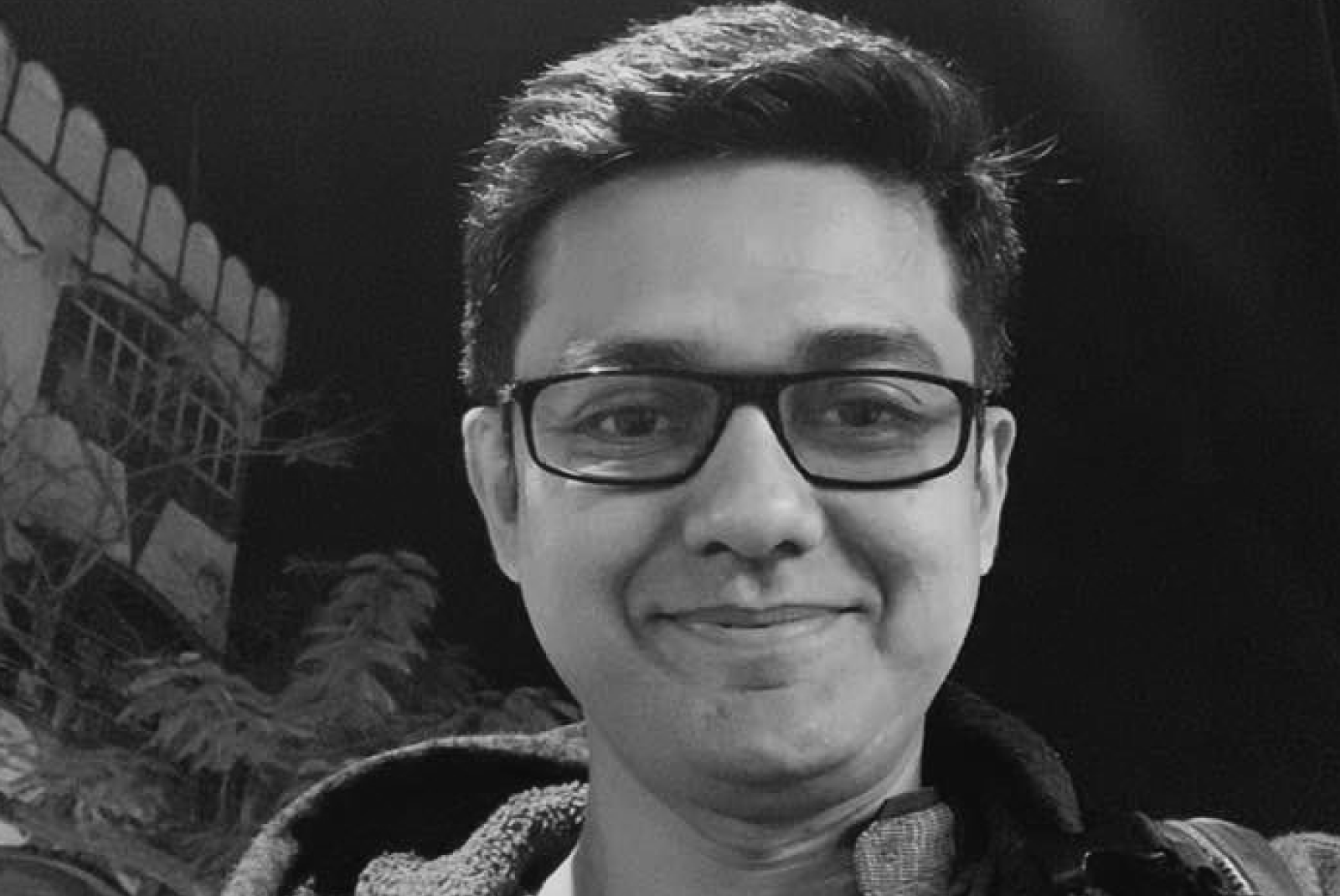
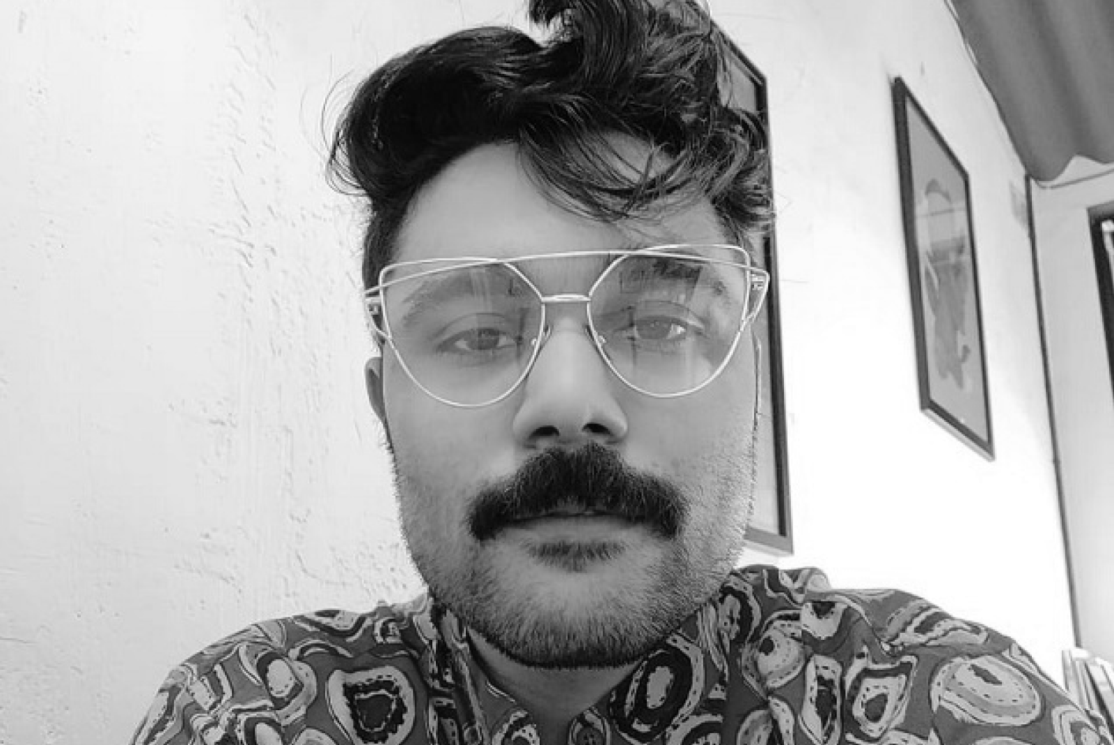
Aniruddh Mehta is a designer inspired by basic shapes in nature and simple mathematical and design rules. He is the founder of Studio Bigfat, an independent Design Studio based out of Mumbai. Aniruddh has been playing along with shapes and creating digital artwork for quite some time now. Today we are here to discuss a case study of the Sacred Games title sequence for which Aniruddha has been instrumental.


